What Colours Should the Mother of the Bride Wear?
Why colour matters


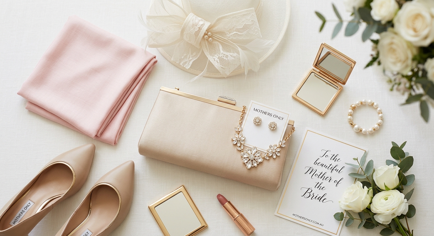
Choosing the right Mother of the Bride colour is one of the simplest ways to make sure the outfit feels elegant, modern, and suitable for the wedding. Colour affects everything: how formal the dress feels, how it photographs, how it works with the venue, and how confident you feel wearing it. The best shade is not necessarily the boldest one or the safest one — it is the one that works with the entire day.
For many Australian weddings, colour also needs to work with the season and the light. A beach ceremony, a winery wedding, a city ballroom, and a garden reception all call for slightly different approaches. A colour that looks beautiful indoors may feel too heavy in summer sun, while a soft tone that seems easy may disappear in a formal evening setting. That is why the best colour choice is always contextual.
Mother of the Bride colour can also help define your place in the wedding party. You want to look polished and well-dressed without competing with the bride or the bridesmaids. A carefully chosen colour achieves that balance better than a complicated design ever could. It is one of the quietest ways to create a refined look.
If you are starting the search, browse the collections and the broader homepage to see the range of colours and silhouettes side by side. The blog and about us pages can also help you get a feel for the brand’s overall styling before you narrow down the final dress.
Bridal style advice from Brides often points to the same idea: the most successful MOB outfits are the ones that feel polished, considerate, and in step with the day.
Best colour families
There is no single “correct” Mother of the Bride colour, but there are a few colour families that tend to work especially well. Soft neutrals like champagne, taupe, silver, and dove grey are popular because they feel refined and easy to coordinate. They work well in formal settings and usually photograph beautifully without taking over the image.
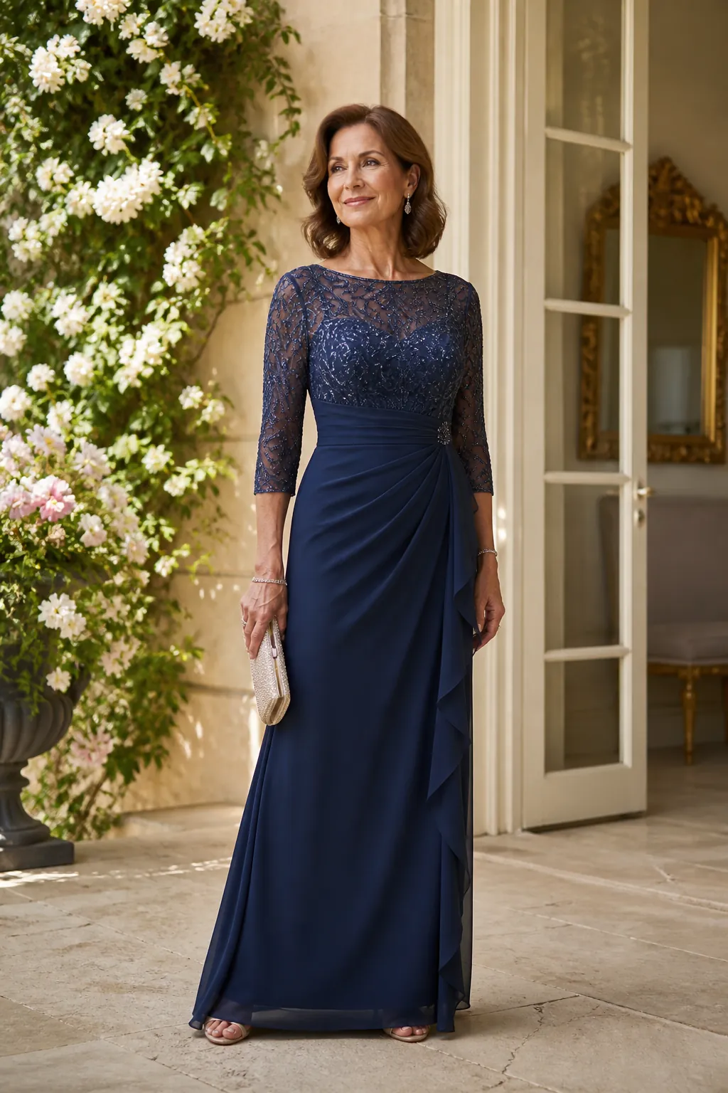
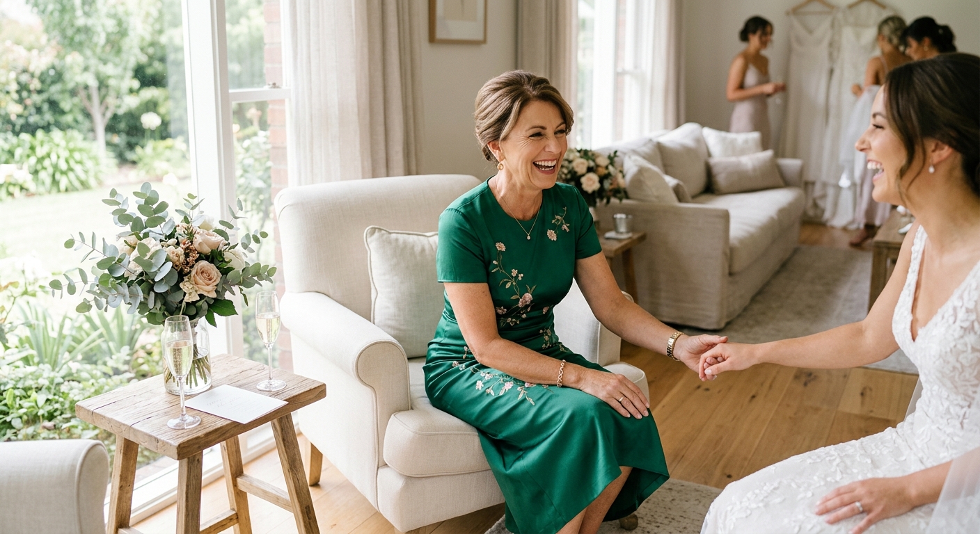
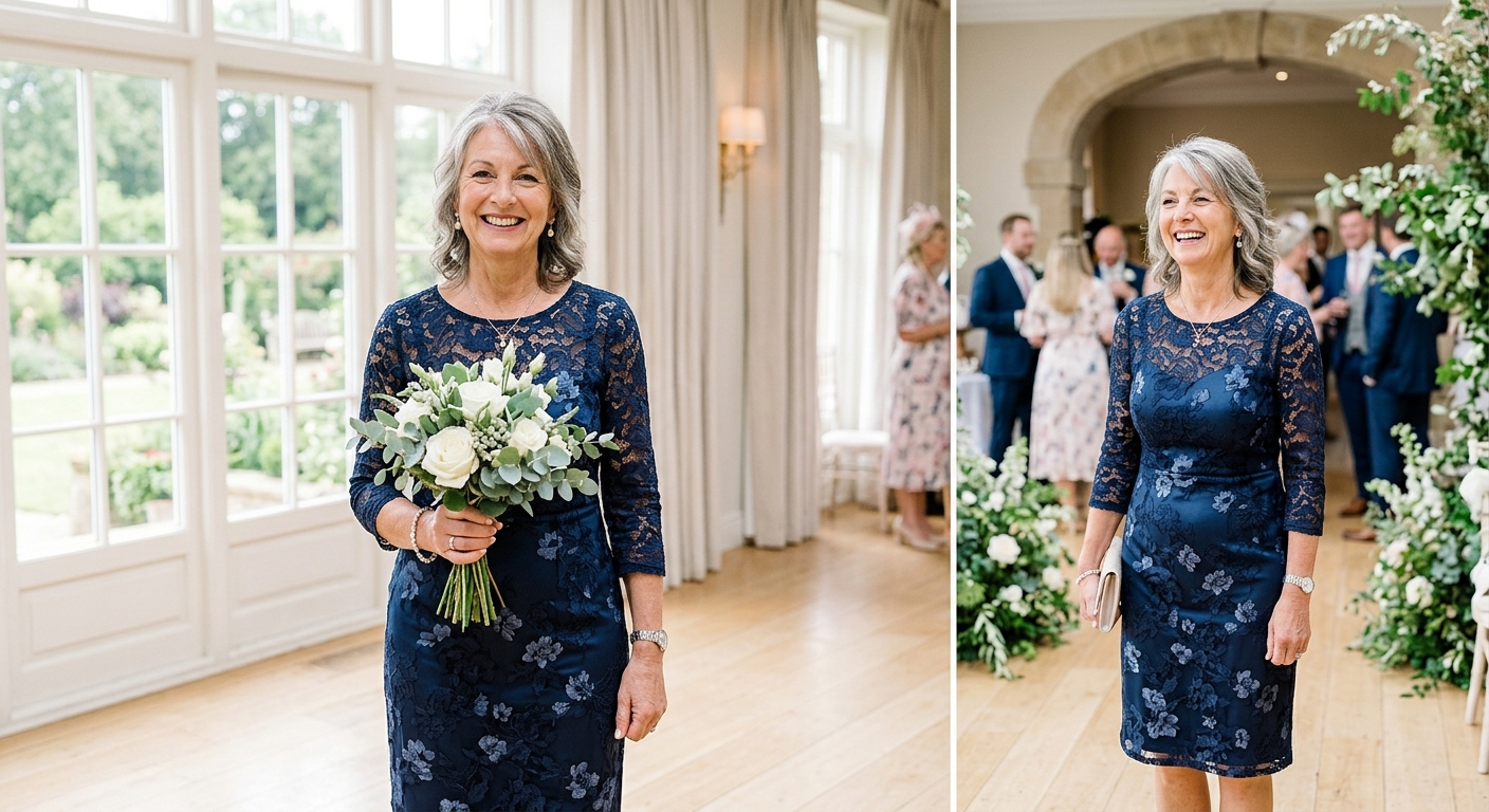
Jewel tones are another strong option. Navy, plum, emerald, and deep blue can feel sophisticated and modern at the same time, especially for evening weddings or cooler seasons. These colours have presence without becoming flashy, which is exactly what many mothers want in a formal outfit.
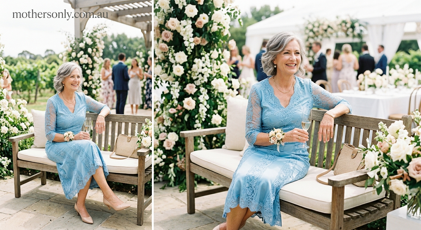
Muted pastels also deserve a place in the conversation. Dusty rose, pale blue, sage, and soft mauve can be lovely for spring and summer weddings, particularly if the bridal palette leans romantic or garden-inspired. These shades can feel very gentle and flattering when the rest of the styling is restrained.
Earthy tones are increasingly popular too. Soft mocha, dusky green, warm beige, and muted bronze can suit more relaxed or outdoor weddings and are often flattering in natural light. They feel calm, contemporary, and easy to style with accessories.
The best colour family is often the one that feels harmonious with the skin tone, the season, and the venue. If you want to compare options, the collections pages make it easier to see which shades look best across different silhouettes.
For broader style inspiration, Harper’s BAZAAR and Vogue often show how colour, cut, and styling can work together to create an elegant formal look without unnecessary fuss.
Choose by season and venue
The season is one of the most useful guides when choosing a Mother of the Bride colour. In summer, lighter and fresher shades often feel natural. In winter, deeper and richer tones usually feel more grounded and formal. That does not mean you have to follow the season rigidly, but it is a helpful way to narrow the list.
Outdoor weddings usually call for colours that sit comfortably within the landscape. A garden ceremony might suit soft pink, sage, or muted blue. A beach wedding may feel best in sand, ivory, champagne, or coastal neutrals. For a winery or country venue, earthy greens, dusty plums, or deep navy can look beautiful against the background.
Indoor weddings, especially more formal evening events, can support a slightly richer palette. That might mean a darker jewel tone or a more polished neutral with a little depth. In these settings, a dress colour can have a bit more drama without feeling out of place.
It is also worth thinking about lighting. Some shades look warmer under evening light, while others brighten beautifully in daylight. A dress that looks elegant in both conditions is a smart choice because wedding days often move between different spaces and times of day.
For Australian weddings specifically, versatility matters. A colour that feels too heavy in the heat may not be the best summer choice, even if it looks beautiful in the shop. Likewise, a very pale shade can disappear in the evening if the dress lacks structure or detail. The colour should work as part of the whole look, not in isolation.
If you are deciding with a venue in mind, the blog and about us pages can help you stay aligned with the mood and formality of the occasion before you settle on the colour.
Advice from Brides and Martha Stewart Weddings often shows how the right colour choice can tie together the venue, season, and dress code without needing a lot of extra styling.
What to avoid
Some colours can look beautiful in theory but are less effective in practice. Overly bright colours can sometimes feel too loud for a formal wedding, especially if the bridal palette is soft or restrained. A Mother of the Bride outfit should generally feel composed and polished rather than attention-seeking.
Colours that clash with the bride’s chosen palette can also create unnecessary tension in photos and in person. Even if there is no formal colour rule, it is usually wise to avoid anything that feels jarringly separate from the overall tone of the wedding. Harmony is usually more elegant than contrast.
Extremely pale shades can work, but they need careful handling. A very light dress may disappear in bright sunlight or blend too closely with the bridal look if it is not clearly distinct in shape or texture. If you love a pale tone, choose a fabric and silhouette that give it more presence.
On the other end of the spectrum, very dark colours can feel a little heavy in the wrong setting. That does not mean navy or black are off-limits, but they need to suit the venue and season. A dark colour can look incredibly sophisticated when it is paired with the right texture and accessories.
The safest approach is to avoid extremes unless you are sure they suit the wedding. A balanced, refined shade will usually give you a better result than a colour that dominates the outfit or disappears into the background.
If you want a second opinion while narrowing things down, the collections view is helpful because it lets you compare several colours side by side. The homepage also gives you a quick look at the overall brand tone.
Accessories and finish
Accessories can completely change how a Mother of the Bride colour reads. A soft neutral may look more glamorous with metallic shoes or jewellery, while a jewel tone may feel more modern with understated accessories. The idea is to support the colour rather than compete with it.
When the dress colour is already doing a lot of the work, it is often best to keep the rest of the outfit simple. A refined clutch, a polished shoe, and one elegant piece of jewellery may be all you need. This helps the colour remain the focal point and keeps the outfit looking controlled.
Fabric finish also affects colour perception. A matte fabric will make a shade feel softer and quieter, while a subtle sheen may give it more formality and depth. If you are choosing between two similar colours, the fabric finish may be the deciding factor in how modern the dress feels.
Hair and makeup can influence how the colour looks too. A strong lip or a very polished hairstyle can make a muted dress feel more composed, while a lighter beauty look can keep a richer colour from feeling too heavy. The whole outfit should be considered together, not just the dress alone.
It is always worth trying the full look on before the wedding, including shoes and accessories. That way you can see whether the colour feels balanced against the rest of the outfit. Small adjustments to accessories often make a big difference.
If you need to revisit style ideas before making the final choice, the blog and about us pages are useful places to reset the styling direction and make sure the colour still feels right.
Wedding style coverage from Harper’s BAZAAR and Vogue often shows how small accessory choices can shift the feel of a colour from simple to elegant in one step.
Planning with the wedding party
Choosing the right Mother of the Bride colour is usually easier when you are thinking about the whole wedding party. You do not need to match the bride or bridesmaids exactly, but you do want to feel visually connected to the event. That means checking the colour palette early and making sure your outfit works with the broader styling decisions.
If the wedding has a clearly defined palette, it is often easiest to choose a shade that lives within the same family rather than introducing something completely new. That helps the photos feel harmonious and makes the outfit feel intentional. Coordination is the goal, not exact matching.
It is also worth thinking about the Mother of the Groom, especially if both families are dressing formally. The outfits do not have to match, but they should feel equally considered. Similar formality and a balanced colour tone often work beautifully together.
Be sure to ask about the overall style of the wedding too. A black-tie event, a relaxed garden celebration, and a coastal ceremony may all ask for different colour moods. Once you know the atmosphere, the colour choice becomes much clearer.
For more guidance while comparing shades, the collections are the best place to see how colours work across different styles. The blog can also help you stay on track with the tone of the event.
For broader context, Brides regularly emphasises that a mother’s outfit should complement the day rather than compete with it — and colour is one of the easiest ways to do that well.
Frequently asked questions
What colours should the Mother of the Bride wear?
The best colour is the one that suits the wedding setting, the season, and your skin tone while still feeling elegant and appropriate. Soft neutrals, muted pastels, and refined jewel tones are all strong options.
Should the Mother of the Bride match the wedding colours?
Not necessarily match exactly, but the outfit should coordinate with the wedding palette. A similar tone or complementary shade usually looks better than something that clashes.
Can the Mother of the Bride wear black?
Yes, black can work beautifully for a formal wedding if it suits the venue and overall tone. It often looks especially strong when paired with elegant fabric and thoughtful accessories.
What colours look best in summer weddings?
Lighter, fresher shades like blush, sage, champagne, pale blue, and soft neutrals often work well in summer. The best choice is one that looks polished in natural light and feels comfortable for the season.